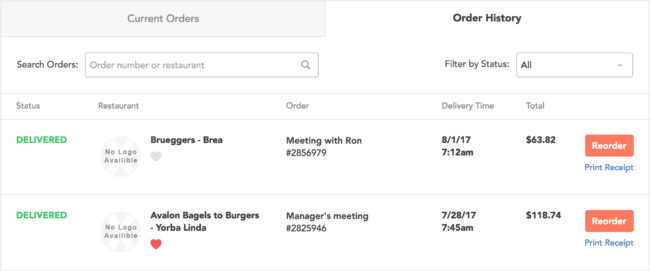
A lot of my time at Bite Squad was spent streamlining the food ordering process on our desktop and mobile websites. The foodify project was one of the most significant development efforts undertaken for desktop. The old method of showing current and historical orders via MDL-style cards on the homepage and in a dedicated ‘your orders’ page was clunky and required lots of clicking to drill down to useful content or action.
Another problem was that the user admin area wasn’t quick and intuitive and in need of revamping. The calendar view also needed some work. From a UX perspective, it needed to be more easily searched and digested. From a developer’s point of view, updating the calendar to employ the same API being created for the order list view would address some technical debt.
Everybody wins!
The desktop/mobile site team took on the foodify project. We created backend API methods to support user order data requests bound to a Backbone.js-enabled frontend to create a much more dynamic user experience. We worked with designers directly to ensure their vision was attainable with minimal effort and would work for “sad path” scenarios. Everything at Bite Squad is “happy path” – a real glass-half-full sort of mentality shared there 🙂
We also added live searching and order status filtering so that users would be able to quickly navigate through all orders. A similar effort was undertaken for the calendar view and existing technical was successfully addressed. We then completely overhauled the user admin area, updating address, saved credit cards, and profile pages.
